


Vista completa
Articoli simili
Giocattolo per donne adulte, vibratore proiettile dildo punto G con 10 potenti modalità di vibrazione, stimolatore di rose adatto per il clitoride
197 venduto
25,04€35,60€
Colore : rosso


Quantità :
 Customer Service
Rapporto
Includere la violazione del copyrightSpedizione standard gratuita. Guarda i detagli
Stimato tra Tue, Oct 21 e Tue, Oct 28
Puoi restituire il prodotto entro 30 giorni dal ricevimento. Guarda i detagli
Acquista con fiducia

Garanzia di rimborso
Ricevi l'articolo che hai ordinato o ti verrà restituito il denaro. Saperne di più
Informazioni su questo articolo
Il venditore si assume ogni responsabilità per questa inserzione.Codice articolo: 22672491
Specifiche degli articoli
Descrizione dell'articolo da parte del venditore
❤ Magical DILDO with powerful motor: This vibrator has a powerful vibration motor that can stimulate your G-spot. This female sex toy is ergonomically designed with a hollow end for easy grip.
❤ 10 powerful vibration modes: The G-spot vibrator has 10 vibration modes, which can be divided into 3 types: interval, continuous, and high frequency, stimulating the G-spot at different frequencies, so you can choose according to your preferences. Although the vibrator is powerful, this stimulator has low noise.
❤ Material that is harmless to the body: It is made of silicone that is harmless to the body and has a soft and comfortable touch. With just a little lubrication, it's easy to use. The soft and smooth appearance can care for sensitive areas.
❤ Waterproof and USB charging: This clitoral stimulator is waterproof for daily use and easy to clean. Comes with a convenient USB charging cable, allowing you to charge through a phone charger, computer, or mobile power source. Charge for 2 hours, approximately 1 hour.
❤ Portable and Concealed Packaging: The size of this massager is easy to carry, so you can use it while traveling. Careful packaging ensures your privacy concerns. High quality clitoral vibrator reliable after-sales service. If you have any questions, please contact us (Information Seller Information Send Message). We will reply within 24 hours. Please note that adult products do not have a shelf life. Individuals under 18 years old are not eligible to purchase.
From brand
/** Used when device=desktop * configured in: configuration/raw config/global/brand store. cfg */* Because the care is implemented as an ol list, any lists in the card text will have a secondary list style (letters) This will give an incorrect appearance to viewers, so we set all lists to the primary list style (numbers). */ Aplus brand store card ol li {list style: decimal;}/* Top level containers */. plus module. apm brand store hero {- moz box sizing: border box;
-Webkit box sizing: border box; Box sizing: border box; Width: 1464px; Height: 625px; Background color: # fff;} Aplus module. apm brand story card {- moz box size: border box; - webkit box size: border box; box size: border box; width: 362px; height: 453px; background color: # fff;}. apm brand story hero,. apm brand story card {- moz box size: border box; - webkit box size: border box; x size: border box; position: relative; width: 100%; height: 100%; float: none;}. plus module. brand store card 1-four asin. apm brand store card {/* Only 12px to account for image cell border */padding: 12px;}/* Full background image (Hero 1- webkit box sizing: border box; box sizing: border box; overflow: hidden; position: absolute; Width: 100%; Height: 100%;}/* Card 1 small images */. plus module. apm brand story ima
Ge row {- moz box size: border box; - webkit box size: border box; box size: border box; height: 185px; padding: 0px; margin: auto; display: flex;}. plus module. apm brand store image row. apm brand store image cell {/* Use content box to ensure image size matches editor schema */- moz box size: content box - webkit box size: content box; box size: content box; padding: 0px; margin: 0px; width: 166px; border: 1px solid # fff;}. plus module. app brand story image row. app brand story image cell. app brand story image link {display: block; width: 100%; height: 100%;} . plus module. app brand store image row. app brand store image cell. app brand store image link. app brand store image img {display: block; width: 100%; height: 100%; object fit: cover;}/* Card 3 image */. plus module. app brand store image {- moz box sizing:
Content box- Webkit box sizing: content box; Box sizing: content box; Height: 145px; Margin: 0px 4px; Padding: 20px; Padding bottom: 0px;}/* Text overlays */. plus module. apm brand story text bottom {- moz box size: border box; - webkit box size: border box; box size: border box; position: absolute; bottom: 13px; left: 13px;}. plus module. apm brand story hero. apm brand story text bottom {background color: rgba (0,0,0.6)); color: # fff; padding: 13px 65px 13px 13px;/* accounts for overlay of first card */width: 437px;}. plus module. brand store card 2-media asset. apm brand store text bottom {background color: rgba (255255255,0.6); color: # 000; padding: 13px; width: 336px;} . plus module. brand store card 1-four asin. apm brand store text {margin top: 8px;}. plus module. brand store card 1-four asin
Apm brand store text. apm brand store text. apm brand store text single {margin top: 20px;}. plus module. brand store card 1-four asin. apm brand store text h3 {white space: overwrite; overflow: hidden; text overflow: ellipsis;}. plus module. apm brand store slogan text {- moz box sizing: content box; - webkit box sizing: content box; box size Zing: content box; margin: 0px 4px; padding: 20px;}. plus module. apm brand store faq {- moz box size: content box; - webkit box size: content box; box size: content box; padding top: 10px;}. plus module. apm brand store faq block {margin: 0px 10px; padding: 10px;} . plus v2. apm brand store carousel container {position: relative;}. plus v2. apm brand store carousel hero container,. plus v2. apm brand store carousel hero container>div {position: absolute; width: 100%;}
/*Ensuring the carousel takes only the space it needs The sizes need to be set against the absolutely positioned elements so they can take up space. */ Aplus v2. apm brand store interior container,. plus v2. apm brand store interior container {height: 625px; width: 100%; max width: 1464px; margin left: auto; margin right: auto; overflow: hidden;}/* This centers the interior vertically on top of the hero image container and after the area (125px) Margin top=(HeroHeight - cardHeight - AreaHeight)/2+AreaHeight */. plus v2. apm brand story carousel. a carousel row inner {margin top: 149px;}/* Cards need to have a width set, otherwise they default to 50px or so. All cards must have the same width The care will resize itself so all cards take the width of the lar
Gest card The left margin is for leaving a space between each card. */ Aplus v2. apm brand story carousel. a carousel card {width: 362px; margin left: 30px important;}/* styling the navigation buttons so they are tellers, flush with the sides, and have a clean white background */. plus v2. apm brand story carousel. a carousel col. a carousel left,. plus v2. apm brand story carousel. a carousel ousel col. a carousel right {padding: 0px;}. plus v2. apm brand story carousel. a carousel col. a carousel left. a button image,. plus v2. apm brand story carousel. a carousel col. a carousel right. a button image {border: none; margin: 0px;} . plus v2. apm brand story carousel. a carousel col. a carousel left. a button image. a button inner,. plus v2. apm brand story carousel. a carousel col. a carousel right. a button image. a button inner{
Background: # fff; Padding: 20px 6px;} Aplus v2. apm brand story carousel. a carousel col. a carousel left. a button image. a button inner {border radius: 0px 4px 4px 0px;}. apm brand story carousel. a carousel col. a carousel right. a button image. a button inner {border radius: 4px 0px 0px 4px;}
Tuitionua Female Toys
Start a wonderful journal of toys with Tutionua
Previous page
Tuitionua has a long history of advancing high quality adult toys to the public
Our sex toys are unique in design, powerful in function and high in quality, a choice you won't register It can help people improve the quality of their sex life
Next page
(function (f) {var np=(window. P. namespace ("BrandStoryAplusModule"); if (np. guardFatal) {np. guardFatal (f) (np);} else {f (np);}} (function (P) {P. when ('brand store care '). execute (function (init) {init();}));
Product Description
. plus v2. precision aplus module-2. precision bac
Background wrapper {position: relative;}. plus v2. premium aplus module-2. premium intro wrapper {position: absolute; width: 50%; height: 100%; top: 0;}. plus v2. premium aplus module-2. premium intro wrapper. right {left: 50%;} HTML [dir="rtl"]. plus v2. premium aplus module-2. premium intro wrapper. right {left: auto; right: 50%;}. plus v2. premium aplus module-2. premium intro wrapper. secondary color {color: # fff;}. plus v2. premium aplus module-2. premium intro background {padding: 20px;}. plus v2. premium aplus module-2. plus module-2 topic {padding base: 10px;}. plus v2. premium aplus module-2. plus module-2. plus m module-2 heading {padding bottom: 20px;} . plus v2. minimal aplus module-2. plus module-2 description {line height: 1.5em;}. plus v2. minimal aplus module-2. minimal intro background. white background {background: rgba (255255255,0.5);}. plus v2. minimal aplus module-2. minimal intro background. black background {background: rgba (0,
0,0,0.5);} Aplus-v2. remium aplus module-2. remium intro background. black background,. plus v2. remium aplus module-2. remium intro background. black background h1,. plus v2. remium aplus module-2. remium intro background. black background h5,. plus v2. remium aplus module-2. remium intro background. black background ol,. a plus v2. remium aplus module-2. remium intro background. black background ul,. plus v2. remium aplus module-2. remium intro background. black background ol. a list item,. plus v2. remium aplus module-2. remium intro background. black background ul. a list item {color: # fff;}. plus v2. remium aplus module-2. remium intro background ul. a list item {color: # fff;}. plus v2. remium aplus module-2. minimum intro content container {display: table; height: 100%;} . plus v2. prompt aplus module-2. prompt intro wrapper. leftt. prompt intro content container {padding left: 40px;} HTML [dir="rtl"]. plus v2. prompt aplus module-2. prompt intro wrapper. leftt. prompt intro content container {padding left: 0px; padding right: 40px;}. plus v2. prem
Ium aplus module-2. delicate intro wrapper. right. delicate intro content container {padding right: 40px;} HTML [dir="rtl"]. plus v2. delicate aplus module-2. delicate intro wrapper. right. delicate intro content container {padding right: 0px; padding left: 40px;}. plus v2. delicate aplus module-2. delicate intro content container column {display: table cell; vertical align: middle;}/* * Premium modules global styles */. plus v2. desktop {max width: 1464px; min width: 800px; margin left: auto; margin right: auto; word wrap: break word; overflow wrap: break word; word break: break word;}/* Do this for tech specs because it breaks Table layout */. plus v2. desktop. prompt aplus. plus tech spec table {word break: initial;} . plus v2. remium aplus,. plus v2. remium aplus. plus h1,. plus v2. remium aplus. plus h2,. plus v2. remium aplus. plus p1,. plus v2. remium aplus. plus p2,. plus v2. remium aplus. plus p3,. plus v2. remium aplus. plus accent1,. plus v2
Mium-plus. plus accent2 {font family: Arabic, sans serif;}. plus v2. premium aplus,. plus v2. premium aplus. plus h1,. plus v2. premium aplus. plus h2,. plus v2. premium aplus. plus p1,. plus v2. premium aplus. plus p2,. plus v2. premium aplus. plus p3,. plus v2. premium aplus. plus p3,. plus v2. premium aplus. m-aplus. plus accent1,. plus v2. premium aplus. plus accent2 {font family: inherit;}/* type */. aplus v2. premium aplus. plus h1 {font size: 32px; line height: 1.2em; font weight: 500;}. aplus v2. premium aplus. plus h2 {font size: 26px; line height: 1.25em; font weight: 500;}. aplus v2 2. precision aplus. plus-h3 {font size: 18px; line height: 1.25em; font weight: 500;}. plus-v2. precision aplus. plus-p1 {font size: 20px; line height: 1.3em; font weight: 300;} . plus v2. minimal aplus. plus p2 {font size: 16px; line height: 1.4em; font weight: 300;}. plus v2. minimal aplus. plus p3 {font size: 14px; line height: 1.4em; font weight: 300;}. plus v2. minimal aplus. plus accent1 {font size: 16px; line height
Ight: 1.4em; Font weight: 600;} Aplus v2. minimal aplus. add content2 {font size: 14px; line height: 1.4em; font weight: 600;}/* spacing */. plus v2. plus container-1 {padding: 40px;}. plus v2. plus container-1-2 {padding: 40px 80px;}. plus v2. plus container-2 {padding: 80px;}. plus v2. plus container-3 {padding: 80px;} Padding: 40px 0;}/* Display */. plus v2. premium aplus. plus display table {display: table;}. plus v2. premium aplus. plus display table cell {display: table cell;}. plus v2. premium aplus. plus display inline block {display: inline block;}/* Aplus display table with min width 1000px and fill rem Maintaining space inside parent */. plus v2. desktop. precious aplus. plus display table width {min width: 1000px; width: 100%} /***Padding and margin for element should be 10, 20, 40, or 80 px Consulting mini 10, small 20, medium 40, large 80. */* * Premium module 11: FAQs */. plus v2. minimum aplus module-11 {background: # fff; position: relative;}. plus v
2. precision aplus module-11. plus secondary color {background: # 000;}. plus v2. precision aplus module-11. plus question,. plus v2. precision aplus module-11. plus answer {display: block; width: 100%; margin: 0;}. plus v2. precision aplus module-11. plus question {position: relative; line height: 25px; padding spot Tom: 10px;}. plus v2. podium aplus module-11. plus answer {option: 0; height: 0; - webkit transformer: translateY (-100%); - moz transformer: translateY (-100%); - ms transformer: translateY (-100%); - o transformer: translateY (-100%); transformer: translateY (-100%);}. plus v2. podium aplus module-11. plus active. plus us answer {option: 1; height: auto; min height: 20px; -Webkit transform: translateY (0)- Moz transform: translateY (0)- Ms transform: translateY (0)- O-transform: translateY (0); Transform: translateY (0)- Webkit transition: option 0.1s linear 0.1s- Moz transition: option 0.1s linear 0.1s- Ms tran
Site: capacity 0.1s linear 0.1s- O-transition: aperture 0.1s linear 0.1s; Transition: capacity 0.1s linear 0.1s;} Aplus v2. premium aplus module-11. faq block {position: relative; padding left: 100px; padding top: 10px; padding bottom: 15px; padding right: 80px; cursor: pointer; background: # fff; border: 2px solid # E6E6E6; border radius: 3px; margin bottom: 10px; - webkit transition: background 0.1s linear; - moz - transition: background 0.1s linear; - ms transition: background 0.1s linear; - o transition: background 0.1s linear; - o transition: background 0.1s linear; transition: background 0.1s linear;} HTML [dir="rtl"]. plus v2. minimal aplus module-11. faq block {padding left: 80px; padding right: 100px;}. plus v2. minimal aplus module-11. faq block. aplus active {padding - bottom: 35px;} . plus v2. premium aplus module-11. plus secondary color. faq block {border: none;}. plus v2. premium aplus module-11. faq block:: after,. plus v2. premium aplus module-11. faq block
k: : before {width: 80px; line height: 40px; font size: 25px; text align: center; border radius: 3px; display: inline block; font weight: 500; top: 10px; left: 10px;}. plus v2. precision aplus module-11. faq block: after {content: "Q"; background: # 505050; color: # fff; position: absolute; - webkit transient ion: background 0.1s linear; - moz transition: background 0.1s linear; - ms transition: background 0.1s linear; - o transition: background 0.1s linear; transition: background 0.1s linear;}. plus v2. precision aplus module-11. faq block:: before {content: "A"; background: # F5A623; color: # fff; position: absolute;} HTML [dir="rtl"]. plus - v2. precision aplus module-11. faq block:: after, HTML [dir="rtl"]. plus v2. precious aplus module-11. faq block:: before {right: 10px;}. plus v2. precious aplus module-11. faq block. aplus active:: after {background: # 404040;}. plus v2. precious aplus module-11. faq block. aplus active: before {p
Adding top: 40px- Webkit transition: padding top 0.1s linear- Moz transition: padding top 0.1s linear- Ms transition: padding top 0.1s linear- O transition: padding top 0.1s linear; Transition: padding top 0.1s linear;} Aplus v2. premium aplus module-11. faq arrow {position: absolute; top: 25px; right: 40px; border: 10px solid transparent; border top color: # 505050;} HTML [dir="rtl"]. plus v2. premium aplus module-11. faq arrow {right: auto; left: 40px;}. plus v2. premium aplus module-11. plus active. faq arrow {top: 15px; border top color: transparent; border bottom color: # F5A623;} Cut (function (init) {if (init) {return;} P.register ('premium module-11 faq ', function() {return function()) {P.when ('A ','jQuery', 'ready'). ex
Execute (function (A, $) {function initFaq (module)} var MODULE-CLASSNAME='premium plus module-11 '; var FAQ-CONTAINER-CLASSNAME='faqs container'; var FAQ-BLACK-CLASSNAME='faq block '; var moduleId=$(module). data ('faq block'); var $faqBlocks=$('. plus v2.'+MODULE-CLASSNAME ASS-NAME+'.'+FAQ-CONTAINER-CLASSNAME+'.'+moduleId+'.'+FAQ_BLOCK-CLASSNAME);/* Using jQuery event namespace for preventing duplicate binding on twister refresh */$faqBlocks. unbind ('click. precimAplusModule11ClickHandle '). bind ('click. precimAplusModule11ClickHandle'), function (e) {if ($(this). hasClass ('aplus active ')) {faqBlocks. removeClass ('aplus active');/* deactivate others */} $(this). taggleClass ('aplus active ')/* Activate the clicked block*/
});}$ (". plus v2. precision aplus module-11. faqs container"). each (function (index, module) {initFaq (module);});};});});/* ** Premium module 12: Nav Carousel */. plus v2. precision aplus module-12. plus carousel card {position: relative; width: 100%;}. plus v2. precision aplus module-12. plus carousel container {position: relative;}. plus v2. precision aplus module-12. plus image carousel container {/* Match the aspect ratio of the desktop image uploaded via the editor (1464px x 600px) */padding top: calc (600/1464 * 100%);/*~40.983% */height: 0;}. plus v2. minimum aplus module-12. plus image carousel container>div {position: absolute; width: 100%; height: 100%; top: 0; left: 0;}/* Overrides AUI styles It should be carefully addressed to measure the slide heights before waiting until images load. */ Aplus v2. precision aplus module-12. a car
Ousel viewport {height: 100% important;}. plus v2. minimum aplus module-12. plus card image img {width: 100%; height: auto;}. plus v2. minimum aplus module-12. plus card details wrapper {position: absolute; top: 0; width: 50%; height: 100%;}. plus v2. minimum aplus module-12. plus card detail {display: tab le; width: 100%; height: 100%}. plus v2. precision aplus module-12. card description {text align: left;} HTML [dir="rtl"]. plus v2. precision aplus module-12. card description {text align: right;}. plus v2. precision aplus module-12. plus table cell {display: table cell; vertical align: middle;}. plus v2. remium aplus module-12. plus text background {padding: 20px;} . plus v2. prompt aplus module-12. plus text background color {background: rgba (0, 0, 0, 0.5);}. plus v2. prompt aplus module-12. plus text background color,. plus v2. prompt aplus module-12. plus text background color h1,. plus v2. prompt aplus module-12. plus
-Text background color h5,. plus v2. prompt aplus module-12. plus text background color ol,. plus v2. prompt aplus module-12. plus text background color ul,. plus v2. prompt aplus module-12. plus text aplus module-12. plus text background color ol. a list item,. plus v2. prompt aplus module-12. plus text background color ul. a-l - ist item {color: # fff;}. plus v2. minimal aplus module-12. description {padding top: 20px;}/* nav */. plus v2. minimal aplus module-12. plus self actions {position: absolute; top: 20px; width: 100%; text align: center;}. plus v2. minimal aplus module-12. plus goto-b {display: inline block; margin: 7px 10px; cursor: pointer; border radius: 30px; border: 2px solid # 000; line height: 2.5em; Min width: 200px; Background color: # fff; White space: nowrap; Color: # 000;} Aplus v2. minimal aplus module-12. plus carousel index {display: none;}. plus v2. minimal aplus module-12. plus goto-b. plus active {border color: # fff;
Background color: # 000; Color: # fff;}/* ** Regimen template specific CSS */. plus v2. remium aplus module-12. plus goto-b. legal {text align: left;} HTML [dir="rtl"]. plus v2. remium aplus module-12. plus goto-b. legal {text align: right;}. plus v2. remium aplus module-12. plus carousel actions. regimen {text align: right; top: 50%; wimen dth: 250px; right: 75px; - webkit transformer: translateY (-50%); - moz transformer: translateY (-50%); - o transformer: translateY (-50%); transformer: translateY (-50%);} HTML [dir="rtl"]. plus v2. minimal aplus module-12. plus circle actions. regen {text align: left; top: 50%; left: 75px; right: auto;}. add us-v2. minimal aplus module-12. plus goto-b. regemen {display: inline block; margin: 10px 10px; Cursor: pointer; Border radius: 30px; Border: 2px solid # 000; Line height: 2.5em; Width: 220px; Background color: # fff; White space: nowrap;} Aplus v2. precision aplus module-12. plus-
Goto-b. legitimate. plus active {border color: # fff; background color: # 000; color: # fff;}. plus v2. minimal aplus module-12. plus circle actions. legitimate. plus circle index {display: inline block; margin left: 6px; width: 16px; line height: 26px; color: # 000; text align: center;} HTML [dir="rt" []. plus v2. reminder aplus module-12. plus carousel actions. legal. plus carousel index {margin left: 0px; margin right: 6px;}. plus v2. reminder aplus module-12. plus goto-b. legal. plus active. plus carousel index {color: # fff;}. plus v2. reminder aplus module-12. plus headline top. legal. imen {position: absolute; top: 0; left: 0; width: 100%; background color: # 000; efficiency: 0.5; Text align: center;} Aplus v2. minimal aplus module-12. plus headline top regemen. plus headline {color: # fff; line height: 2em;}/* * Navigation template specific CSS */. plus v2. minimal aplus module-12-- top nav. plus carousel actions {b
Background color: rgba (0, 0, 0, 0.8); Top: 0px;} Aplus v2. minimal aplus module-12-- top nav. plus goto-b {padding: 8px; color: # fff; background color: transparent; border: none;}. plus v2. minimal aplus module-12-- top nav. plus goto-b. plus active {text decoration: underline; text underline offset: 0.8em; text decoration backlog: 3px; background color: transparent; border: none;} (function (f) {var np=(window. P.namespace ("PremiumAplusModule")); if (np. guardFatal) {np. guardFatal (f) (np);} else {f (np);}} (function (P) {P.now ('premium module-12 nav carousel '). execute (function (init) {if (init) {return;} P.register er ('premium module-12 nav carousel', function() {return function()) P.when ('A ','jQuery', 'a carousel framework', 'ready'). execute (function (A, $, framework) {function initiate Carousel (module) {var MODULeID=$(module). data ('module id ')/**
*Carousel button element classname * @ const */var GOTO-B-CLASSNAME="aplus goto-b -"+MODULeID;/* ** Carousel button element active classname * @ const */var GOTO-B-ACTIVE-CLASSNAME="aplus active";/* ** AUI name for aui carousel * @ const */var CAROUSEL-NAME="premium plus-12 carousel -"+MODULeID;/* ** Module class name * @ const */var MODULE-CLASSNAME=". plus v2. precision aplus module-12";/* ** Carousel text container class name * @ const */var TEXT-CONTAINER-CLASSNAME=MODULE-CLASSNAME+". plus Carousel text container -"+MO
DULE-ID;/* ** Carousel text hidden class name * @ const */var Text-CONTAINER_HIDDEN="aplus hidden";/* ** Carousel horizontal scroll container class name * @ const */var HORIZONTAL_SCROLL_CONTAINER-CLASS.AME=MODULE-CLASSNAME+". plus horizontal scroll container -"+MODULeID; Function showCarouselText (oldIndex, newIndex) {var oldClass=TEXT-CONTAINER-CLASSNAME+"-"+oldIndex; var newClass=TEXT-CONTAINER-CLASSNAME+"-"+newIndex; $(oldClass). addClass (TEXT-CONTAINER-HIDDEN); $(newClass). removeClass (TEXT-CONTAINER-HIDDEN);} function scrollToCarouselButton (scrollLeft) {If ($(HORIZONTAL_SCROLL_CONTAINER_cLASSS-NAME)
Length) {$(HORIZONTAL_SCROLL_CONTAINER.CLASSNAME). animate ({scrollLeft}, 200);}}/* ** Create a CarouselButton class for provided Carousel instance * @ param {object} Carousel - AUI Carousel instance * @ returns {Class} - CarouselButton Class */function CarouselButton Template (Carousel) {/* * * Button for controlling the active slide * @ constructor * @ param {number} index - slide index * @ param {DOMElement} [elem] - optional DOM element to use As this object DOM representation */function CarouselButton (index, elem) {var self=this; This. index=index; This. careous
El=carousel/* Create the button element */this. elem=this. getElem (elem); This$ Elem=$(this. elem)/* Store jquery version */this. elem. addEventListener ('click ', self. handleClick. bind (self))/* Add this object to the object manager */CarouselButton. objects. byId [index]=this; CarouselButton. objects. all. push (this);}/* ** Describe behavior for click events on this. elem * @ memberOf CarouseButton */CarouseButton. prototype. handleClick=function (e) {e.preventDefult(); this. Carousel. gotoPage (this. index);};/* ** Enter active state
*@ memberOf CarouselButton */CarouselButton. prototype. activate=function() {this. $elem. addClass (GOTO-B-ACTIVE-CLASSNAME);};/* ** Enter inactive state * @ memberOf CarouseButton */CarouseButton. prototype. activate=function() {this. $elem. removeClass (GOTO-B-ACTIVE-CLASSNAME);};/* ** Returns an existing or created a new bound element for this object * @ memberOf CarouselButton * @ param {DOMElement} [elem] - optionally provide an existing element in the DOM to use * @ returns {DOMElement} - This object DOM representation */CarouselButton. pr
OTOTYPE. getElem=function (elem) {if (this. elem) return this. elem; if (elem) return elem; var createdElem=document. createElement ('span '); createdElem. className=GOTO-B-CLASSNAME; return createdElem;};/* *@ Const Object manager */CarouselButton. objects={byId: {}, all: [],}; Return CarouselButton;} Framework. onInit (CAROUSEL-NAME, function (carousel) {/* * @ const {Class} */var CarouselButton=CarouselButton Template (carousel)/* Create carousel controls */var $carouselBs=$(safeClassselector (GOTO-B-CLASSNAME)); Var bs=$car
OuselBs. map (function (i, bElem) {return new CarouselButton (i+1, bElem);})/* Activate first one */CarouselButton. objects. byId [1]. active()/* Listen to slide changes */A. on ("a: carousel:"+CAROUSEL-NAME+": change: pageNumber", function (data) {var newCarouselButton=CarouselButton. objects. byId [data. newValue]; var marginLeft=parseInt (getComputedStyle (newCarouselButton. elem). getPropertyValue ('mrgin left ')); var positionLeft=newCarouselButton. elem. offsetLeft) - marginLeft; newCarouselButton. active(); CarouselButton. objects. byId [data. oldValue]. active(); scrollToCarouselButton (positionLeft); showCarouselText (data. oldValue, data. newValue);
});});/* * *@ Returns {string} - css classname pre fixed with module selector */function safeClassSelect (className) {return '.'+MODULE-CLASSNAME+'.'+className;} $('. plus v2. minimal aplus module-12. plus carousel container'). each (function (index, module) {initiate carousel (module);}); Framework. createAll(); Framework. initializeAll();});});
Previous page
Next page
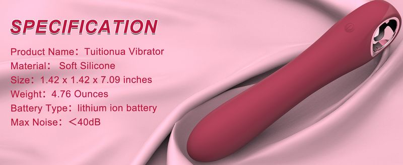
1 Advantage 2 Specification 3 Whisper quiet
(function (f) {var np=(window. P. namespace ("PremiumAplusModule"); if (np. guardFatal) {np. guardFatal (f) (np);} else {f (np);}}} (function (P) {P. when ('premium module-12 nav circle '). execute (function (init) {init();}));
ONE BUTTON SIMPLE Operation
LOTS OF FUN WAITI
NG FOR YOU TO EXPLORE
DISCREET PACKAGING LISTING
What is the after sales policy about the adult toy?
For 12 months after the date of purchase, we take care of all quality related issues with a REACTION
Is it waterproof?
This vibrator is waterproof for daily use and should not be used underwater to prevent water from entering the charging port and damaging the product
How long does it take to fully charge?
It takes 2 hours to fully charge, but please estimate according to the actual remaining power of the product, the indicator light is not flashing means it is fully charged
How does it turn on and use?
There is only one control button on the product Long press for 1.5s to turn on or off, short press to switch the vibration frequency after turning on
(function (f) {var np=(window. P. namespace ("PremiumAplusModule"); if (np. guardFatal) {np. guardFatal (f) (np);} else {f (np);}}} (function (P) {P. when ('premium module-11 faq '). execute (function (init) {init();}));
Btf sub nav de
"Sktop similar tab": ["# miraiBTFShopByLook_feature_div", "# desktop dp btf shopbook", "# sims consolidated-3_feature_div", "# sims consolidated-4_feature_div", "# sims consolidated-5_feature_div", "# sims consolidated-6_feature_div"], "btf sub nav desktop leftAligned": false, "btf sub nav desktop leftAligned" "ktop product information tab": ["# productDetails_feature_div", "# productDetailsNonPets_feature_div", "# productDetails-placement auto_feature_div"], "btf sub nav desktop about this item tab": ["# featurebullets_feature_div", "# richProductInformation_feature_div"], "btf sub nav desktop lateActivation": true, "btf sub nav desktop lateActivation": true, "f-sub nav desktop customer reviews tab: [# customer reviews feature_div], btf sub nav desktop questions tab: [# ask btf_feature_div]}
Back to top
This product
similar
problem
comment
P. When ('A ',' ready '). execute (function (A) {A.on; A. On ('a: expander: MobileProductDescription_expander_m: toggle: collapse ', function()){
If (window}});});
. detail bullet writer ul. detail bullet list {margin: 0 0 1px 18px;}. detail bullet writer ul li {margin bottom: 5.5px;}. detail bullet writer: last child {margin bottom: 4.5px;} Basic information
Packaging size: 22.61 x 7.49 x 4.9 cm; 240 grams
Battery: 1. Lithium ion batteries require batteries.
Listing date: April 11, 2023
Manufacturer: Tuitionua
ASIN
: B0C2419B5Y
Hot selling product ranking: Ranked first among products, G-spot artificial penis
Buyer review:/* * Fix for UDP 1061 Average customer reviews have a small extra line on hover* https://omni-grok..com/xref/src/appgroup/websiteTemplates/retail/SoftlinesDetailPageAssets/udp-intl-lock/src/legacy.css?indexName=WebsiteTemplates#40 */. noOffline a: over {text decoration: none;}. cm cr review start spacing big {margin top: 1px;} 4.3 4.3 stars, maximum of 5 stars 1674 comments var dpAcrHasRegisteredArcLinkClickAction; P. When ('A ',' ready '). execute (function (A) {if (dpAcrHasRegisteredArcLinkClickAction=true) {dpAcrHasRegisteredArcLinkClickAction=true; A. declarative(
'acrLink click metrics',' click ', {"allowLinkDefault": true}, function (event) {if (window. ue) {ue. count ("acrLinkClickCount", (ue. count ("acrLinkClickCount") | | 0)+1);}});}}); P. When ('A ','cf'). execute (function (A) {A. declarative ('acrStarsLink click metrics','click ', {' allowLinkDefault ': true}, function (event) {if (window. ue) {ue. count (' acrStarsLinkWithPopoverClickCount ', (ue. count (' acrStarsLinkWithPopoverClickCount ') | | 0)+1);});
. ask product docs expander content {padding left: 0; margin top: 0;}
. posts-dp same brand de
Sktop cardstyle post care title 3JXTT {color: # c60; font size: 16px; font weight: 700; margin bottom: 8px; padding bottom: 0}_ Posts dp same brand desktop cardstyle post carousel brand information container_3jzC4 {margin bottom: 12px; margin left: 40px; overflow: hidden; position: relative}_ Posts dp same brand desktop cardstyle post carousel brand container _2l11B {display: inline block; margin right: 10px}_ Posts dp same brand desktop cardstyle post care brand __ 2fCkZ {border: 1px solid hsla (0,0%, 7%,. 08); border radius: 50%; height: 48px; vertical align: middle; width: 48px}_ Posts dp same brand desktop cardstyle post carousel brand name container_ 1tpRW {display: inline block; line height: 1em; padding right: 3px; vertical align: middle}_ Posts dp same brand desktop cardstyle post carousel brand name container_1tpRW>a {display: block}_ Posts dp same brand desktop cardstyle post carousel brand name container long_3hF-7 {width: 360px}_ Posts dp same brand desktop cardstyle post carousel brand name container runtime
Ted_3H5U - {width: 180px}_ Posts dp same brand desktop cardstyle post carousel brand follow container_3FO-Z {display: inline block; line height: 48px; margin left: 10px}_ Posts dp same brand desktop cardstyle post carousel brand name_ FFo4L {color: # 0f1111; font size: 14px; font weight: 700}_ Posts dp same brand desktop cardstyle post carousel brand name link_ 2jTxP {font size: 14px}_ Posts dp same brand desktop cardstyle post carousel image_ 3gSWF {height: 240px; - o object fit: cover; object fit: cover; width: 240px}_ Posts dp same brand desktop cardstyle post carousel image caption container_3r3cy {height: 56px; padding: 10px 10px 8px}_ Posts dp same brand desktop cardstyle post carousel image caption_m9Zm8 {color: # 0f1111; font size: 13px}_ Posts dp same brand desktop cardstyle post same brand container_3N012 {margin bottom: 24px; margin top: 20px}_ Posts dp same brand desktop cardstyle post carousel container_1-a11 {margin bottom: 32px}_ Posts dp same brand desktop cardstyle post carousel container_1-a11
. posts dp same brand desktop cardstyle a carousel leader row_ 1ghsK {border: 1px solid hsla (0,0%, 7%,. 08)}_ Posts dp same brand desktop cardstyle post carousel element container_OrvFN {border: 1px solid hsla (0,0%, 7%,. 08); border radius: 4px; width: 240px}_ Posts dp same brand desktop cardstyle brand follow button _GQPgx {background: # fff; border color: # 879596; border radius: 4px; border width:. 1em; box shadow: none; color: # 373e37; font size: 13px; height: 32px; line height: 16px; white space: nowrap; width: 100px}


 4.3 su 5 basato su 6,260 recensioni